You ever worked on a project and found the stylesheets were a mess?
Multiple classes that do almost the same thing? CSS class naming looking super crazy? Zero structure and no kind of logic followed?
Then this is the article for you.
When I started off with CSS a long time ago, it was a messy process. There was absolutely no structure to naming my classes & it was very ‘anything goes’.
A long time ago I said enough is enough. I needed to read about how to best organise my CSS.
This would help when I handover freelance projects to the next developers on the project. It would also help me fix other people stylesheet issues!
Thinking In Components
The first thing I learnt was to think in components. When you first learn about CSS, one of the main things that comes up is that you have to think in boxes. This is a follow-on from that style of thinking.
I think of components as a logical group of CSS boxes. Think about your favourite websites you frequent. Let’s say twitter.
If you had to break down twitter into components, the first thing that would come to my head is the tweet timeline.
It’s a big component made of small components (Tweets) when you really break it down.
The process of mentally breaking down a big component into the individual components, and think about how these relate in terms of collections of boxes (div’s, span’s, p’s etc) really helps with the UI side of front-end development. When you get a good grasp on it, it allows you to translate design to code quite rapidly.
I wrote an article about CSS Box Thinking [here]
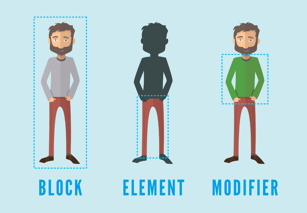
BEM
I started looking at how other people organise CSS styles with a component based approach and I came across something called BEM.
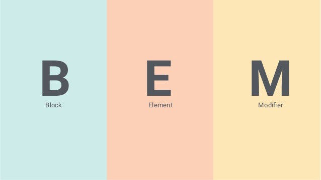
Block. Element. Modifier.
What the hell is that? It’s a naming convention for CSS classes. Based on taking a modular, component based approach to development.
Here is an example in regards to an imaginary checkout form using standard CSS.
| /* Block component */ | |
| .checkout-form { | |
| // .. | |
| } | |
| /* Element that depends upon the block */ | |
| .checkout-form__title { | |
| // .. | |
| } | |
| .checkout-form__input { | |
| // .. | |
| } | |
| .checkout-form__button { | |
| // .. | |
| } | |
| /* Modifier that changes the style of the block */ | |
| .checkout-form--darkmode { | |
| // ... | |
| } | |
| /* Modifier that changes the style of the element */ | |
| .checkout-form__input--big { | |
| // ... | |
| } |
Personally, I always use SASS! (Or PostCSS). It allows me to write better looking CSS like below:
| /* Block component */ | |
| .checkout-form { | |
| /* Elements */ | |
| &__title { | |
| // ... | |
| } | |
| &__button { | |
| // ... | |
| } | |
| &__input { | |
| /* Element-Modifier */ | |
| &--big { | |
| // ... | |
| } | |
| } | |
| /* Block-Modifier */ | |
| &--darkmode{ | |
| // ... | |
| } | |
| } |
The & you see above is a SASS & PostCSS feature. It’s really just a shortcut to reference the parent CSS selector without having to type it out!
See how we don’t have to repeat checkout-form all over our file? (Don’t Repeat Yourself Principle).
This allows you to nest CSS classes in a logical way and lets you keep all related classes together under a main CSS class!
| /* Super simplified html form to illustrate BEM classname usage. */ | |
| <form class="checkout-form checkout-form--darkmode"> | |
| <p class="checkout-form__title"> | |
| Buy Bitcoins! | |
| </p> | |
| <input class="checkout-form__input checkout-form__input--big"/> | |
| <button class="checkout-form__btn"> | |
| Buy Now! | |
| </button> | |
| </form> |
Can you see how BEM can start to give your CSS naming conventions some structure and predictability?
When you get used to it, naming your classes becomes simpler. We reduce horrendous and nasty looking styling & thinking about naming.
It can help you avoid specificity clashes from careless naming & allows you can put your mind towards other things instead!
If you often run into issues with class name clashes , this can really help you name things in a way that avoids that.
Let’s go through and describe each part of the BEM system in a bit more detail.
The Block
We can think of the block as the overarching component that contains many elements.
Carrying on from the examples above, a checkout form could be a block, as it would have many elements. I try and think about things as components and it really goes well with the BEM methodology.
The Element
In the example above, we can see that our form block contains a few elements.**title **input & __button .
The double underscore __ in front of the element’ name is to let the developer know that this is the name of an element.
I try to use it to try and correspond with HTML elements where I can.
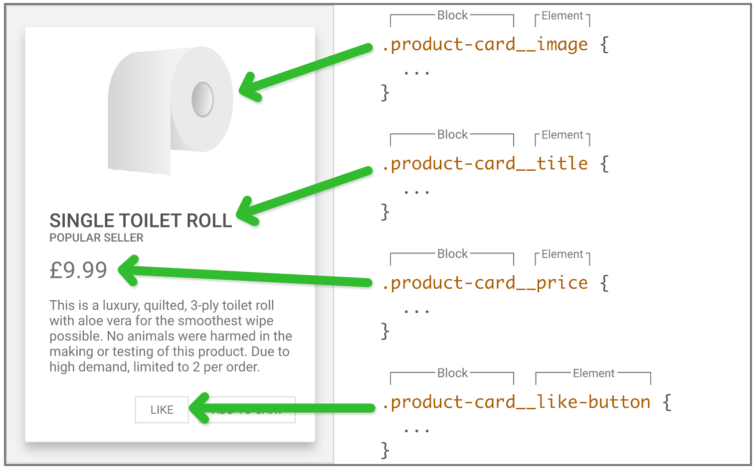
The Modifier
In the previous code examples, you can see that the modifier seems to be able to be applied on either the whole block or the element.
(So sometimes its Block-Modifier, as well as Block-Element-Modifier).
Any good system should always have room for flexibility!
This can be used to add variations to your elements for eg. different types of buttons (a normal one, one for warnings, an extra large one etc.).
Rather than creating 2 different elements for the 2 buttons, we can just make a modifier that makes the button to whatever state you want it to be.
This helps you create reusable code and stops you having to write the same code twice.
]](https://cdn-images-1.medium.com/max/3076/1*F6aXPeYRqAYvvw5hBDZ-0g.png)
What about layout stuff?
When it comes to things like layouts containers, wrappers etc. I don’t strictly use the BEM naming system. Strict usage of anything can become cumbersome.
Utility Classes
I tend to just use simple utility classes for one time things. I might have something like a .flex-container class or a .flex-row to change the flex direction etc. and things to that nature.
If I find im reusing the same amount of padding on a lot of components, I’d probably use a padding utility class too.
As you can see there is no over-arching system that can handle all naming and all situations without things becoming un-flexible! So it’s good to be pragmatic and realistic and stick to it where you can, and break from it when you need to.
That way, anybody who works on the same project with you will appreciate the neatness of the code, but also the fact that it’s flexible to the more difficult situations.
In a nutshell…
Think about having component based, easy to read CSS (Using **BEM**, it’s good to learn) where you can as it helps you code quicker & helps if you have multiple developers using the code.
Don’t treat it like a law. Treat it like a tool!
BTW I’m working on a CSS course with practical tips to help you think in CSS. I want to teach you to be able to look at a design and know exactly how to break it down into CSS.
Subscribe to my newsletter & you’ll get a 30% discount when it drops!
Love,
Alfie